Brighton Women’s Centre
Helping to highlight social injustices faced by women, both in Brighton and around the world.
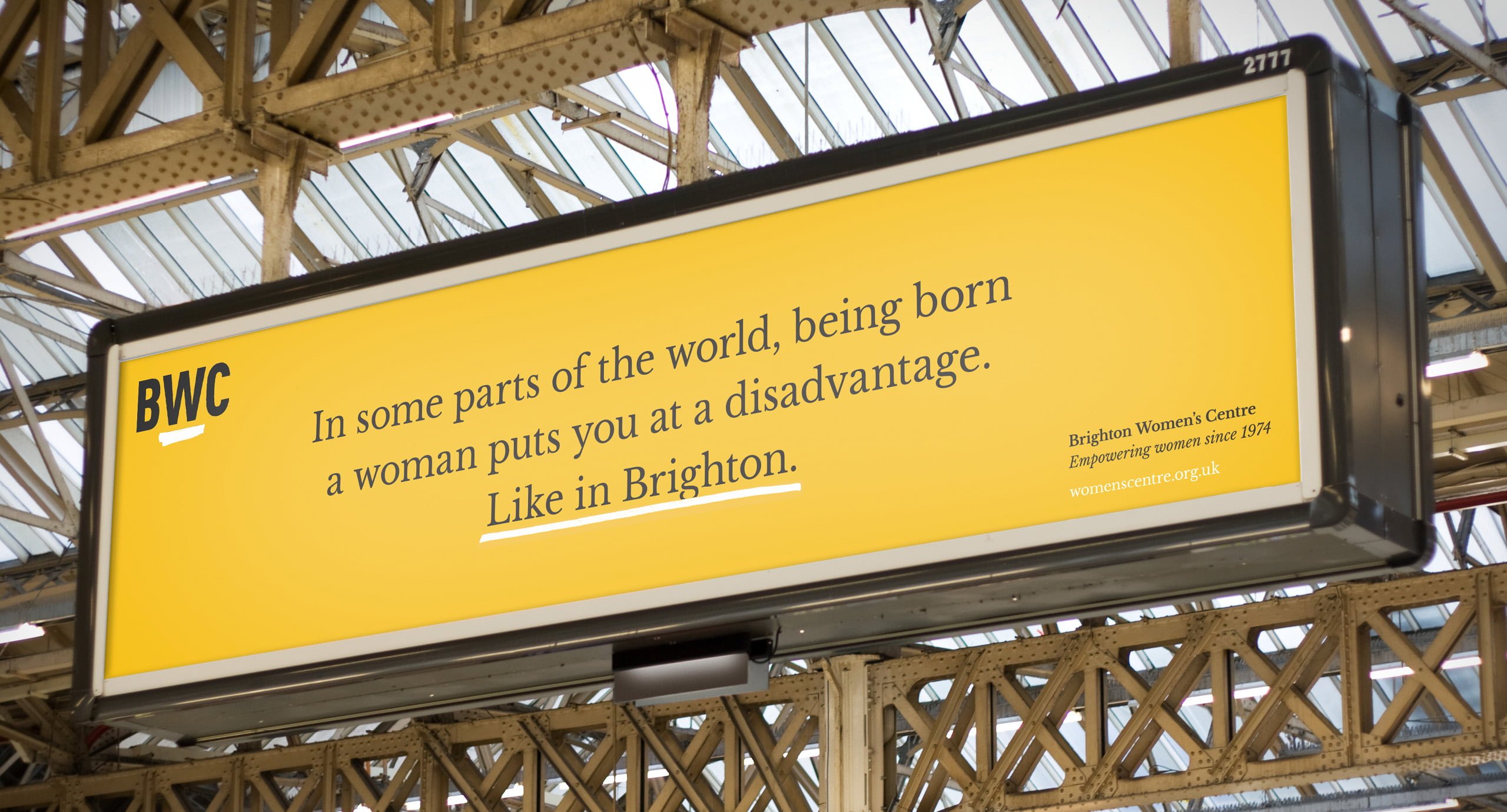
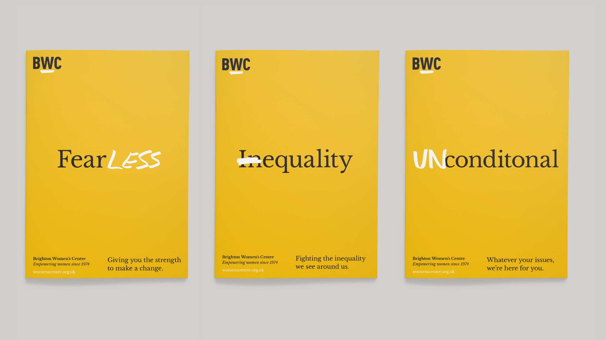
Sometimes, restrictions can be a designer’s friend. So when an amazing, vital charity came to us with a great opportunity but limited resources, we used restrictions to our advantage, using strong words to cut through.
Sector
Charity & Nonprofit
What we did
Discovery & Definition
- Audits
- Consultation
- Workshops
- Interviews
- Brand strategy
- Brand blueprint
- Brand proposition
- Site architecture
Design Development
- Creative concepts
- Brand identity system
- Brand engagement
- Messaging and tone of voice
- Brand expression
- Campaign communications
- Content creation
- Digital expression
- Print design
- Event branding
- Art direction
- Digital design, UI and UX
Delivery
- Brand guidelines
- Brand toolkits
- Tone of voice guidelines
- Brand activation
- CMS training
- Front end development
Context
With women leading countries around the world, you may think that the work on women’s rights is done. Yet equality isn’t a reality for everyone: here in the UK, for every £1 a man earns a woman receives only 85p. For over 44 years, BWC has been helping women from all backgrounds, facing all kinds of issues, to live happier lives. Women dealing with bereavement or trauma, women who have been through homelessness or the criminal justice system, survivors of abuse or discrimination – they’ve welcomed them all.
From the first moment I met Baxter & Bailey it was clear that they were going to be determined to understand the crucial nature of BWC in order to enable us to share it with our audiences. This is evident in the way our organisation’s core essence is now exemplified by our new brand identity. Throughout the process we have felt listened to and involved, and we are delighted to share the work that they have done and to reach a wider audience across Sussex.
Solution
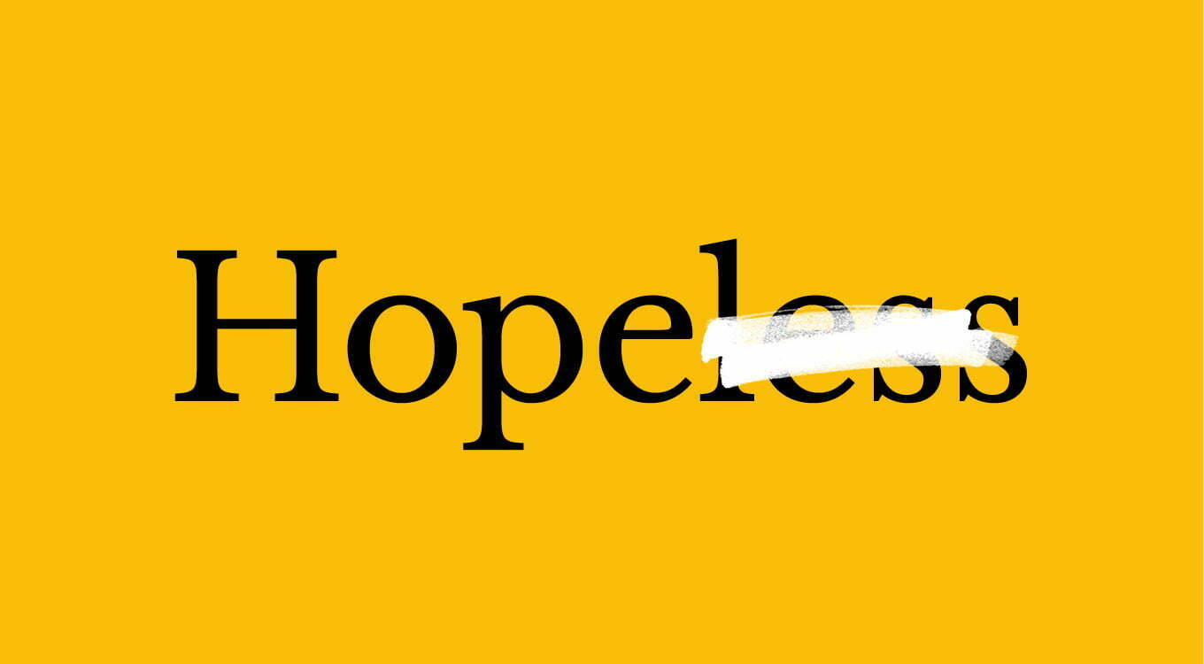
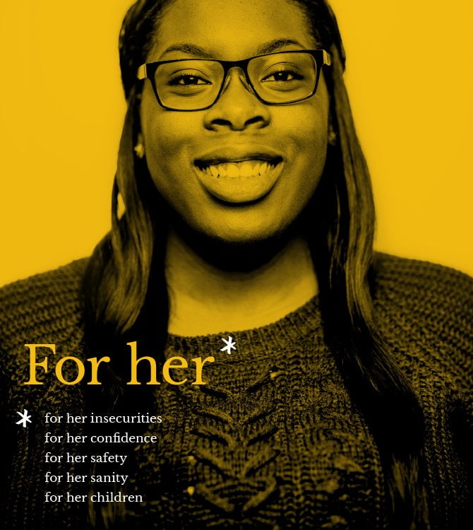
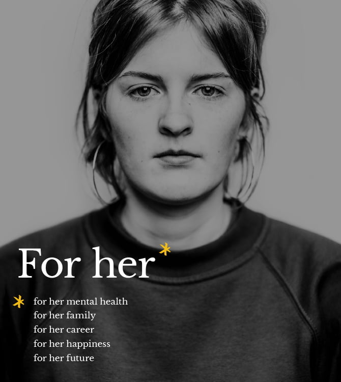
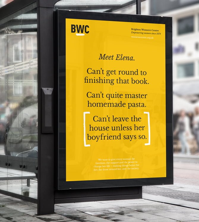
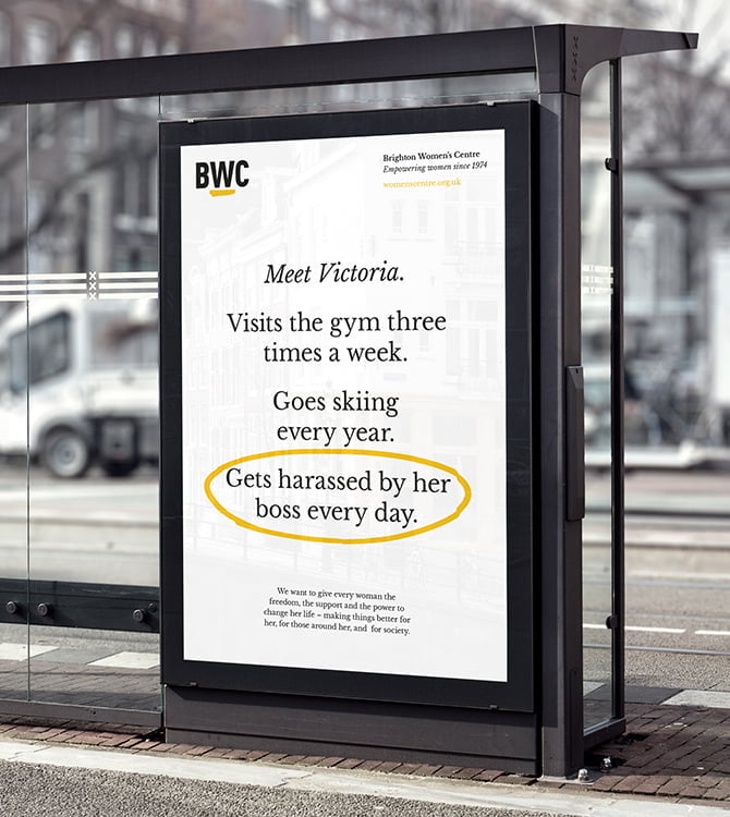
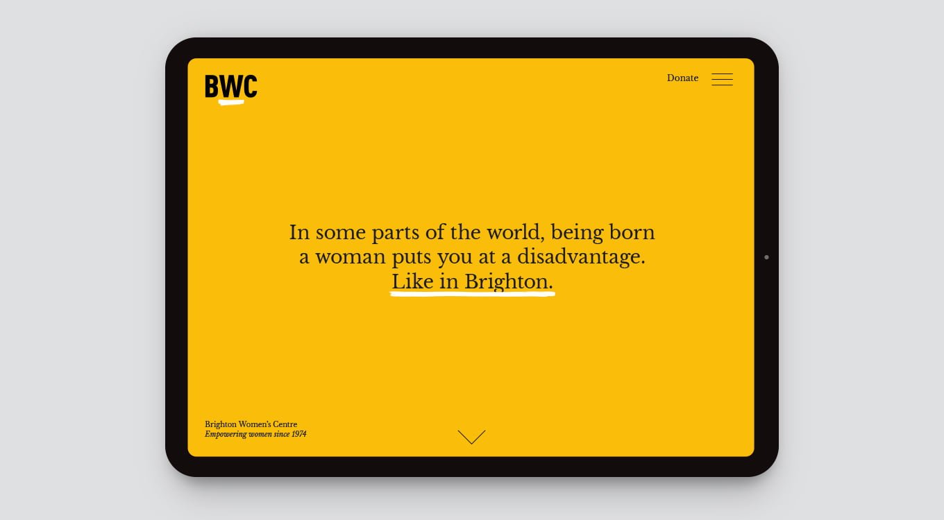
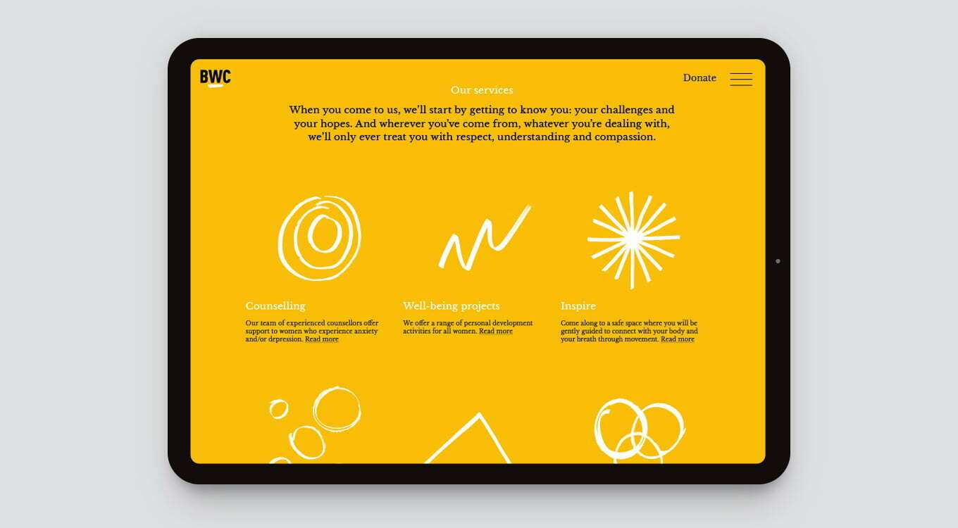
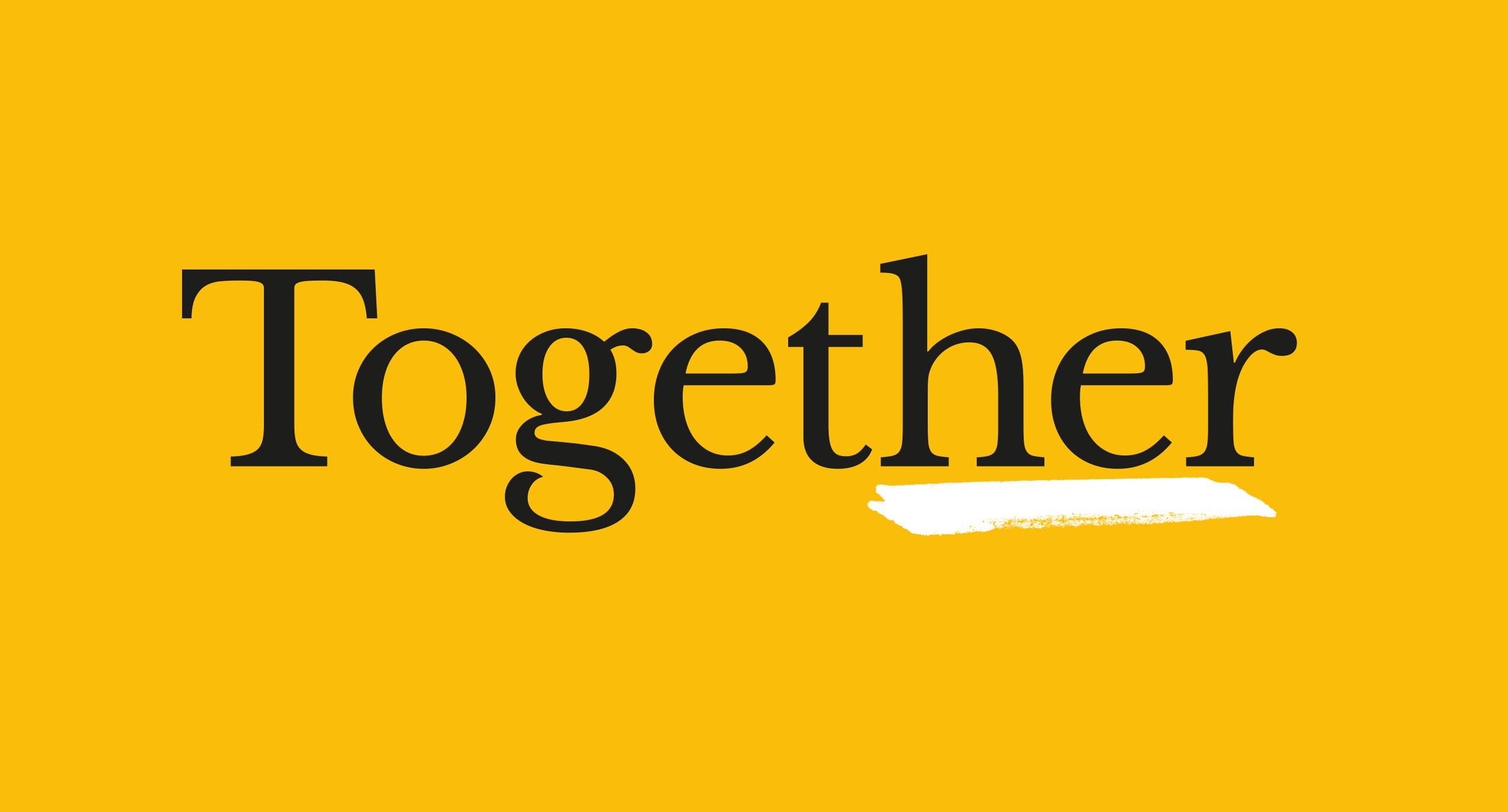
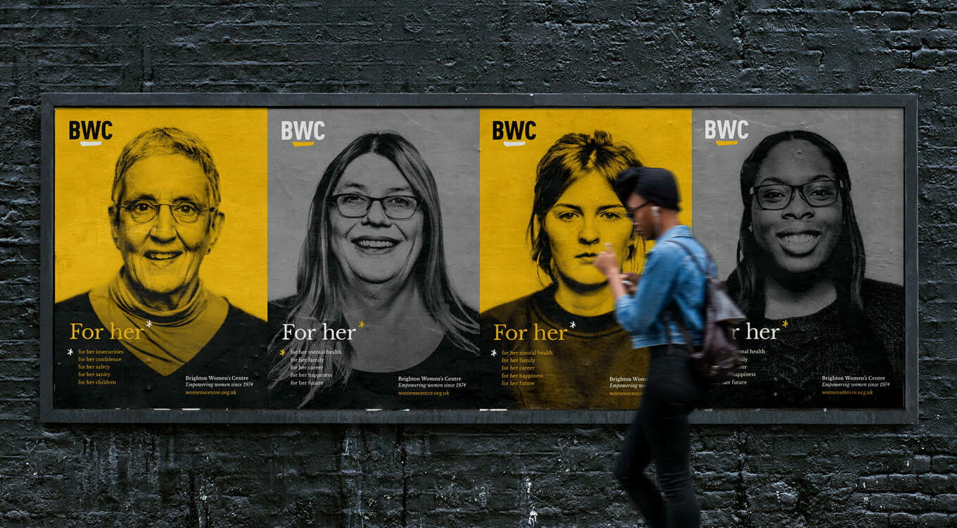
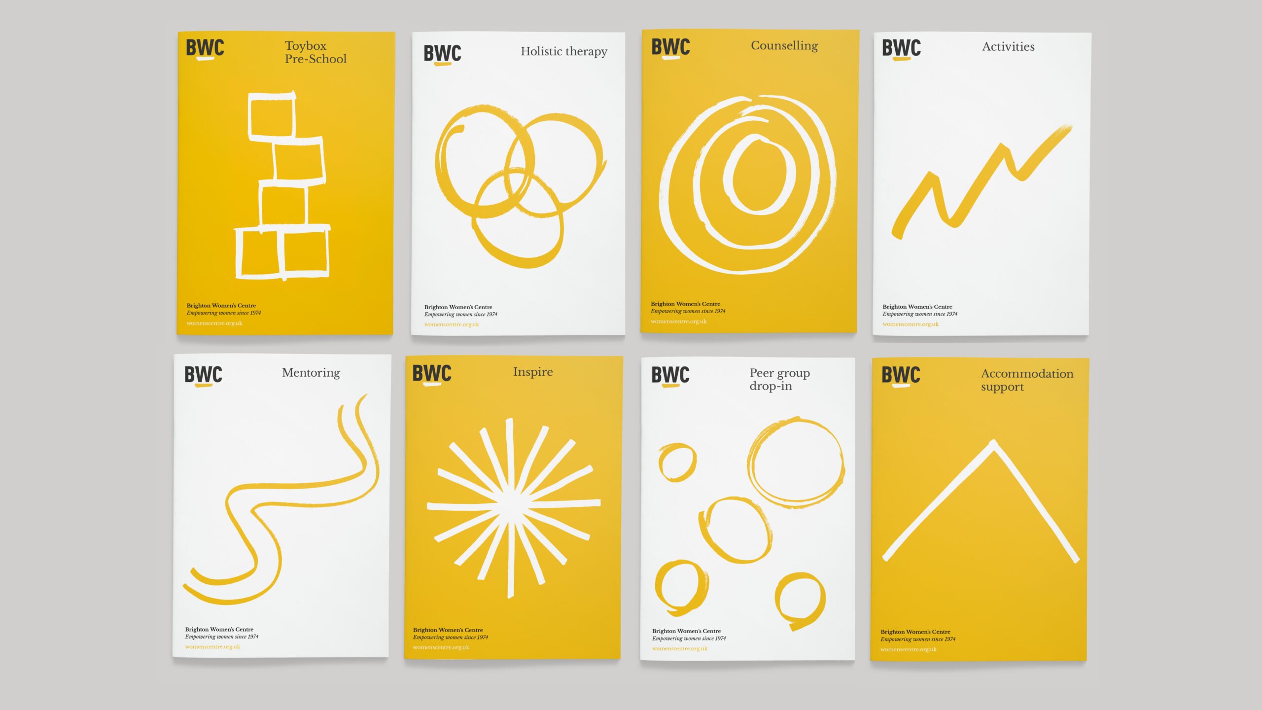
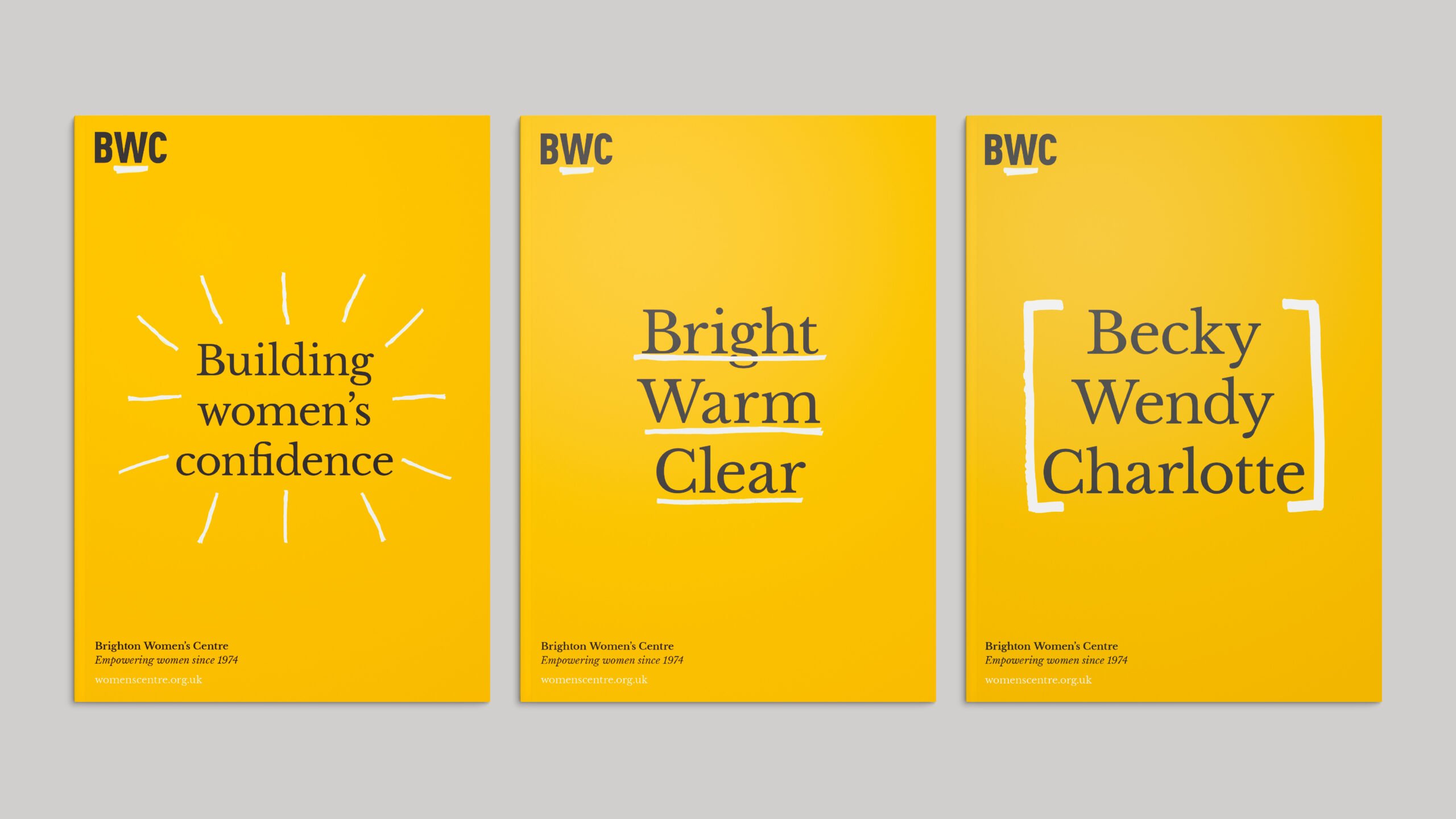
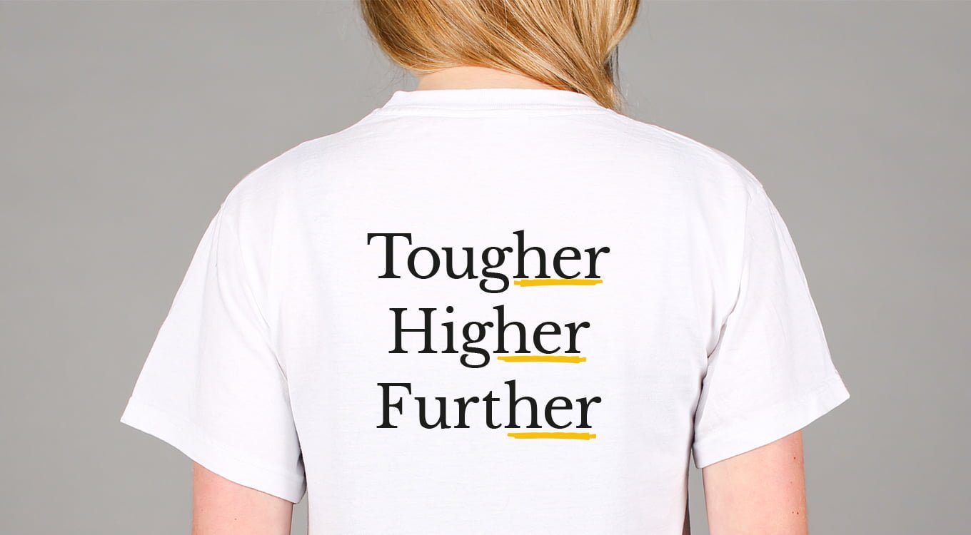
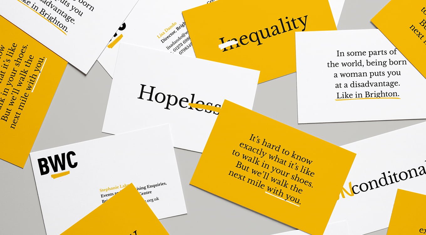
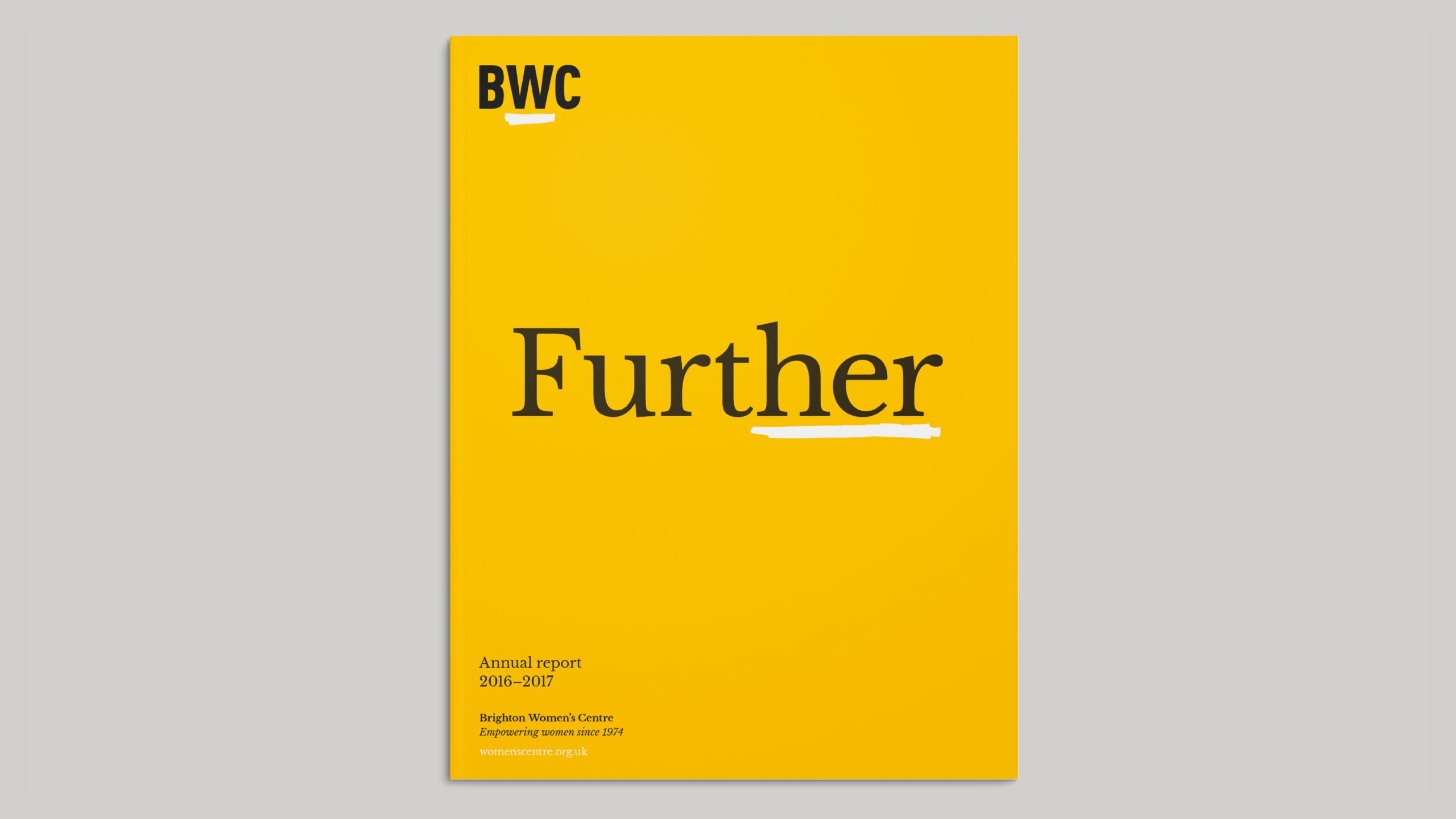
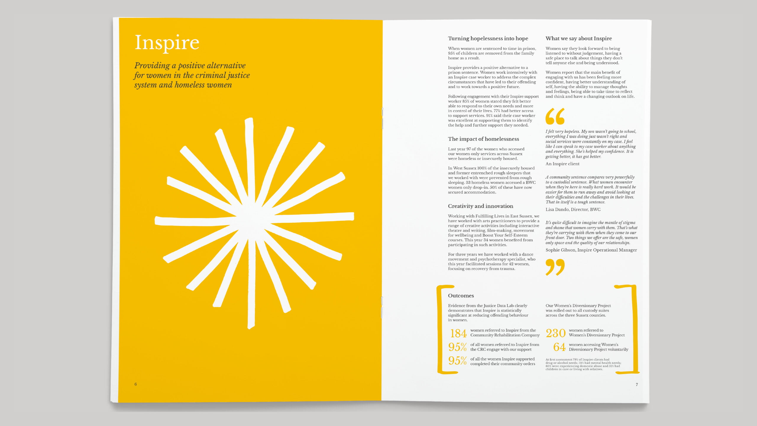
Our brand strategy work and resulting brand identity brings personality to the charity’s communications, encourages support, and highlights the social injustices women face. We maintained a limited, powerful colour palette, ensuring Kate van der Borgh’s powerful copy was supported in the strongest possible way. Singular portrait photography and a simple hand-drawn graphic system kept the resulting identity system flexible, clean and easy to use.
Impact
Our work with BWC was recognised in a range of design industry awards, picking up gold at the European Transform Awards for best brand evolution, a coveted graphite D&AD pencil for Writing For Design, as well as a Drum Design Award.
Awards
Special Thanks
Special thanks to Lisa Dando and the BWC board for their willingness to take this bold step towards a brave new brand identity. And to our very own Sam Watts, web developer extraordinaire, for the build and launch of his first Baxter & Bailey web project.
